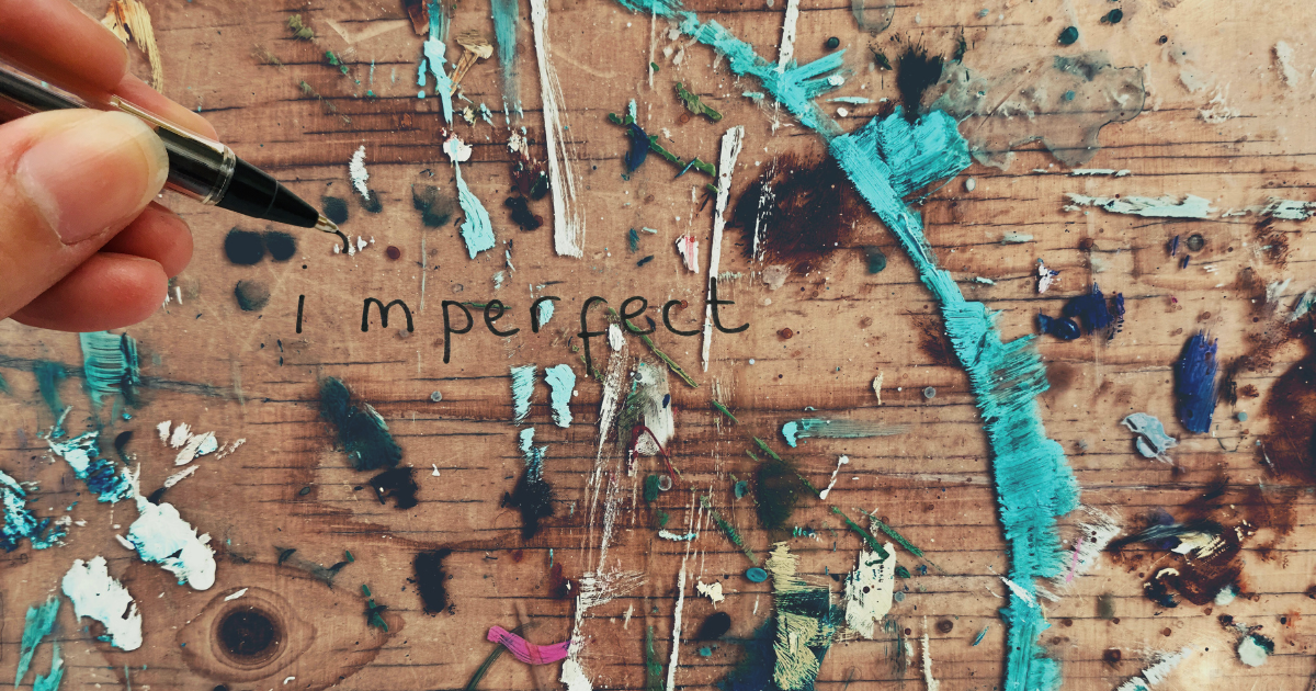
The design world is in full design rebellion against flawless perfection that fails to create emotional impact.
You know it when you see it: AI-generated smoothness, too perfect to be authentic.
After years of AI-generated smoothness dominating visuals—from hyper-clean gradients to pixel-perfect interfaces—a counter-movement has emerged: "imperfect by design." That's where I live. When not writing, I'm doodling, drawing or painting, and my happy place exists in the middle of fresh paint, epoxy and caulk. The kind of stuff you can touch.
But I also work digitally.
Currently, Canva's 2026 Design Trends highlight "Imperfect by Design" as the year's defining theme—a creative rebellion where creators deliberately introduce messiness to reclaim authenticity. In fact, searches for "tactile design" and related textures surged over 30% year-over-year, reflecting a craving for visuals that feel touchable and human-made.
The kind of art we have our hands all over.
It shows no sign of stopping.
This tactile revolution embraces hand-drawn elements, grainy textures, organic imperfections, and raw human touches to create warmer, more relatable brands in an increasingly synthetic landscape.
The shift stems from digital fatigue.
We're ready for the human touch, regardless of how flawed it may be.
AI tools produce impeccable outputs at scale, but audiences increasingly perceive them as soulless, generic and less than authentic. And viewers despise them.
Texture as Tactile Design Rebellion
At the heart of this design rebellion trend lies texture, the tactile experience AI stole from us.
Grainy overlays, paper-like noise, subtle scratches, and waxy or frosted surfaces mimic physical materials, evoking real-world tactility in digital designs. We're talking substance.
Think of a brand logo layered with faint film grain or a website background resembling aged paper—these elements invite viewers to "feel" the design, fostering emotional connection. In an AI-polished world, such textures signal deliberate human intent: proof that a person, not an algorithm, shaped the work.
Hand-drawn elements amplify this warmth. Imperfect lines, wobbly strokes, doodles, and even naïve proportions introduce vulnerability and personality. Organic shapes break rigid symmetry, while visible "mistakes"—ink bleeds, rough edges, or asymmetrical layouts—celebrate humanity over mechanical precision. Brands that adopt these tactile techniques feel approachable, trustworthy, and alive, countering the cold uniformity of AI-generated content.
This rebellion isn't nostalgia alone; it's strategic. In saturated markets, tactile imperfection stands out. It builds emotional resonance — viewers connect with designs that mirror lived experience rather than sterile ideals. For small studios and indie creators, layering hand-drawn icons over grainy textures creates distinction without massive budgets. Larger brands use it for relatability: a coffee chain's packaging with subtle paper grain and hand-sketched motifs feels artisanal and inviting.
These visuals capture the essence: bold, textured illustrations with organic imperfections that feel handcrafted and emotionally charged. Alive, not stripped of humanity.
Less Than Perfect, More Than Enough
The tactile design rebellion reminds us that perfection can feel distant. It's too aloof.
By adding texture, hand-drawn quirks, and intentional flaws, designers craft experiences that resonate deeply—warm, relatable, and unmistakably human.
In an AI era, imperfection isn't a flaw; it's the spark that re-ignites connection.